I am neither technically minded nor gifted. I love words, language and intricate and complex concepts accurately and flamboyantly explicated across several pages.
But I also love analysis and rationalising, and my journalism training taught me to explain things as simply as possible.
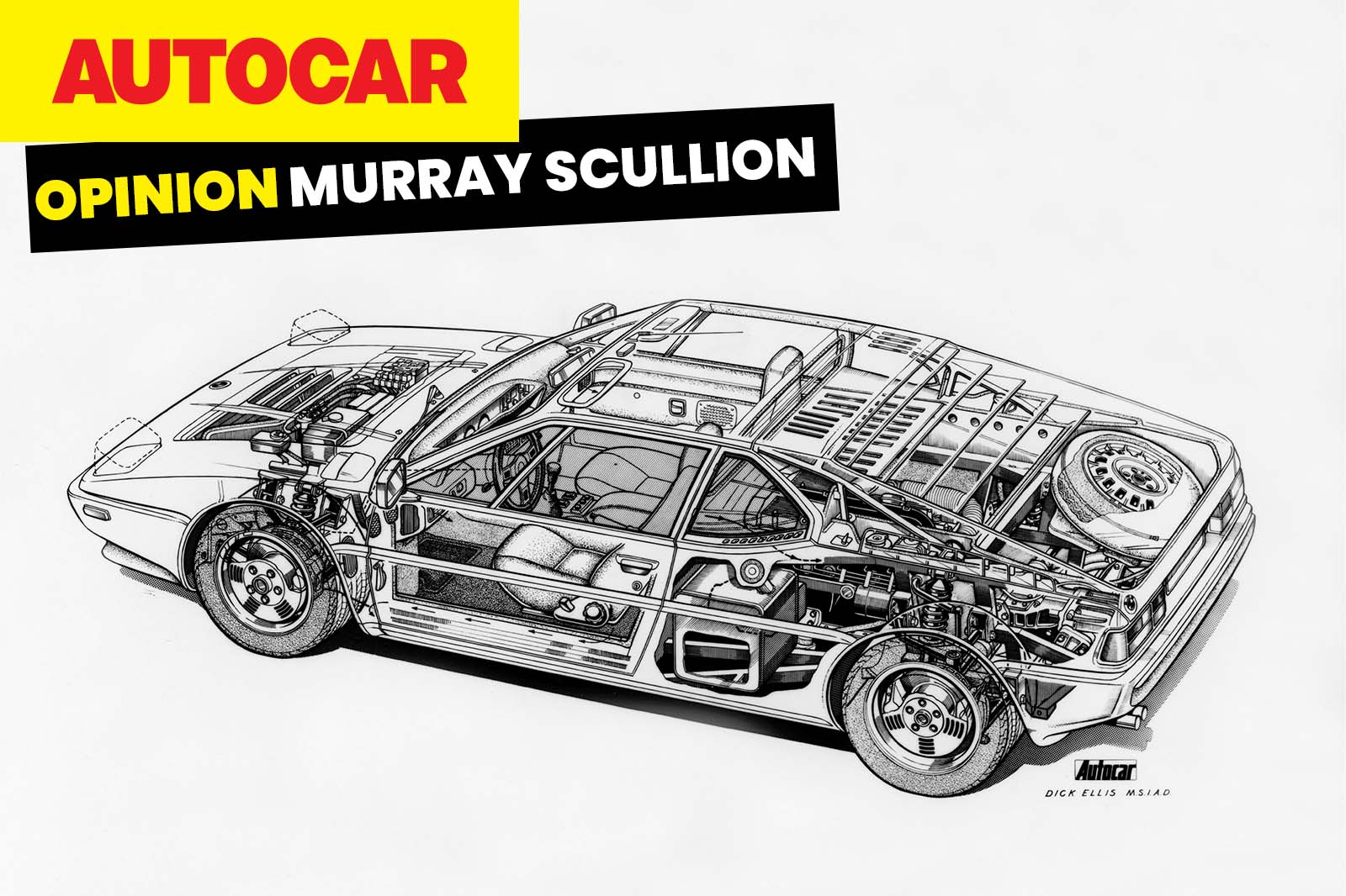
I am one of those people who says “explain it to me like I am 10 years old”, and cutaway drawings go one better: they don’t just explain – they also demonstrate.
They are X-rays into the impenetrable that cut through the words, and when they’re done properly they become genuine bedroom wall poster material.
Cutaways can explain something hugely complicated in just the width of your phone screen.
You can see the intricacies of pistons, cylinder heads, exhaust valves, whatever, and how they join up and work together.
In terms of making the informational engaging, a cutaway diagram is not a 60-year-old maths teacher writing the same algebraic problems on a whiteboard every day for 40 years but the nutty professor mixing bicarbonate of soda and vinegar across the corridor.
Cutaway diagrams can be art, too. Ink artists such as Tony Matthews were employed by the likes of Leyton House to create cutaway diagrams of various components as recently as the 1990s.
It’s painstaking craftsmanship, and the results are mind-blowing: the attention to detail is out of this world.
What I love most is that, like any true artist, those doing it by hand have to employ a great deal of ingenuity, cunning and creativity.

