Age of Mythology: Retold brings a lot of the usual advancements that you’d expect for a reboot of both the increasingly dated 2002 original game and its previous reboot: 2014’s Extended Edition, which is still perfectly playable and available on Steam. The newest version of this real-time strategy classic comes with the requisite improvements in graphics and user interface, making the whole game much easier to look at and parse at a glance. And while the updated voice acting isn’t going to win any awards, neither is the stilted, bare bones dialogue that those actors are working with (which seems faithful to the original game, for better or worse).
But Retold does add one thing that I wasn’t really expecting in a modern real-time strategy game—full support for a handheld controller. Developers have been trying to make RTS games work without the traditional mouse and keyboard since the days of SNES Populous and Starcraft 64, usually with limited success. Microsoft hasn’t given up on the dream, though, fully integrating controller support for Age of Mythology: Retold into both the PC version (which we sampled) and, obviously, the Xbox Series X|S release.
The result is definitely the best version of an RTS controller interface that I’ve tried and proof that a modern controller can be a perfectly functional option for the genre. In the end, though, there are just a few too many annoyances associated with a handheld controller to make it the preferred way to play a game like this.
Too many functions, too few buttons

Microsoft
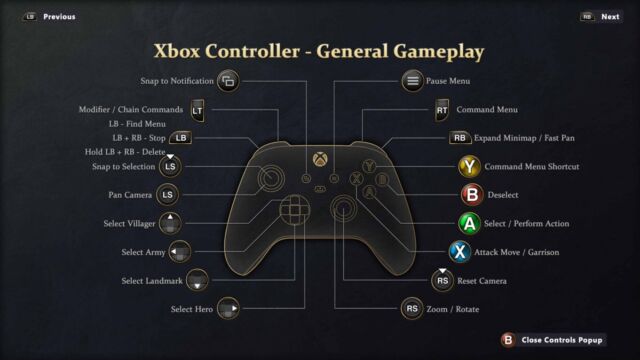
To get a feel for what I mean, just look at the “Controls Popup” summarizing all the things a single controller needs to do in a game like Age of Mythology. The game makes full use of every single button and directional input on the Xbox gamepad for some function or other. Things are so crowded that commands like Stop and Delete need to be mapped to a combination of two shoulder buttons, with different functions for holding and tapping (and there are a few other multi-button menu toggles that aren’t even listed here).
If anything, this diagram undersells the control complexity here. Tapping either trigger brings up context-sensitive radial menus full of general commands or construction options for the currently selected building. Finding the right option then often means scrolling through multiple pages of radial menus in this full-screen interface, an awkward solution to the problem of having too many options for too few buttons.
To the game’s credit, it does its best to limit how much of this menu-based fumbling you have to do. Tapping the Y button when a building is selected, for instance, automatically starts construction on the most common unit you’d want to create with that building. And holding down the Y button maximizes the production queue for that building quickly, saving the need to spend a few seconds clicking through menus to do so.

